
World Cup kits – winners and losers
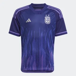
Argentina’s away jersey
We are now only 60 days away from the beginning of the world’s greatest tournament, the FIFA World Cup. In the past couple of weeks all the kits have been released for the nations competing. Some are worth breaking the bank. Others are making me think the design team should be fired. Time to look at the biggest winners and losers for kits of this year’s World Cup.
Winner: Argentina Away
Argentina’s away jersey (soccer.com)
Now this is something new. Purple isn’t a popular color when it comes to creating kits but I don’t know why when it looks this great. Adidas decided to go with the purple in order to represent gender equality. The contrast of the shirt and the light purple lines over the shoulders goes so well together. Flames are something that I didn’t think I would enjoy but something about them being purple just works better than expected. Adidas definitely got creative with this one and I’m glad to see it work.
Loser: U.S.A. Home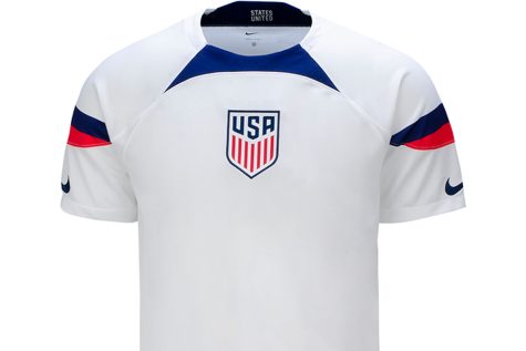
USA’s white home jersey (soccer.com)
Oh Nike, What have you done? The United States has been done dirty here. It is a completely plain white jersey with slight touches of blue and red. The easiest way to describe this jersey is bland and boring. Nike is making 13 of the 32 teams jerseys so I can understand having to repeat designs. It’s normal for big brands to do this but to use their most common away kit design for the US’s HOME kit is absurd. They didn’t make any changes to it at all. The home kit normally has a similar look every year but for Nike to put such little effort into this disgraceful. I don’t know what kind of beef Nike and the US have with each other but they better sort it out soon. Considering Nike is based in the US, it is astonishing that they did this for their own country when our next winner did everything right.
Winner: Germany Home 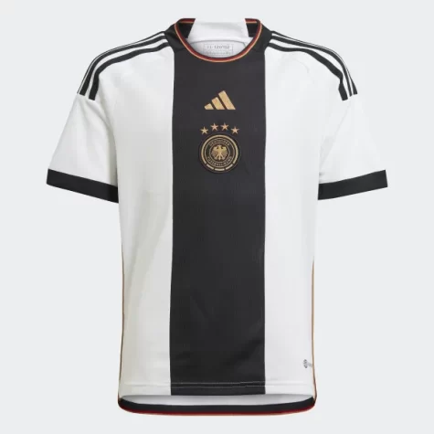
This is how a brand makes a beautiful jersey for their country. Adidas has knocked it out of the part with this one. The giant black stripe right down the middle is the perfect size for it to look good. Not too big and not too small, the goldilocks of stripes.The black lines over the shoulder and on the end of the sleeves makes the black and white contrast perfectly and looks symmetrical. Gold has been pretty common the last few years with Germany’s jerseys and I hope they stay forever because it makes it ten times better. The shine of the badge and Adidas logo just gives this overall simplistic jersey life. The colors of the flag around the collar is a great subtle touch. To be a German must be nice when your team dominates and you get to wear this while cheering them on.
Loser: Switzerland Away 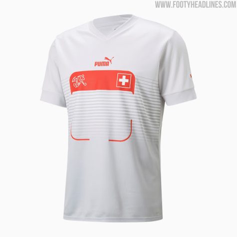
Puma needs to be stopped. Most of the Puma away jerseys are losers but the one I want to specifically focus on is Switzerland’s. I look at it and the only thing that comes to mind is a QR code scanner. This is an example of trying something but not making it work. It is essentially a box in the middle of the shirt and absolutely nothing else. The rest of the shirt is just a light gray. I can’t tell if Puma even tried to be creative with this one. The only thing they managed to do right is incorporate the country’s colors. This is one of those jerseys that I wonder who would even bother spending $90 on. Puma tremendously messed up with their away kits this year.
Winner: Ecuador Away 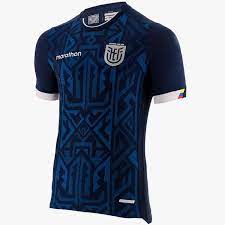
Here we have a hidden gem. Marathon has released a beautiful dark blue kit for the Ecuadorian national team’s return to the World Cup this November. The intricate patterns all over the front have set this apart for me from the rest. The lines within the pattern makes it look like the shirt is coming to life in waves. The decision to go with a block silver color makes the badge fit in well. The pattern and badge share the attention well. Marathon is an Ecuadorian sports equipment company and this is my first time hearing about them. They made a pretty good first impression with this kit but my only downside I find to it is their logo. The word just feels too long and they decided to keep a white color to it rather than going with the silver like the badge. But that aside, I can’t wait to see this kit at the opening game of the tournament.
Loser: Portugal Home 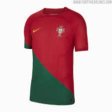
How a group of people in a Nike boardroom decided that this was a good jersey baffles me. It feels like there was no imagination with this one. It is the classic Portugal red until a line that goes through one sleeve and the shirt changes it to a dark green. As a man who loves symmetry, this jersey absolutely kills me to look at. Going through the sleeve just looks so awkward. Going through just the shirt would’ve limited the damage. For Nike to create this bland and ugly kit for Ronaldo’s last World Cup just feels so disrespectful to a great of the game.
Brands use the big stage in order to show off their kits and bring in the casuals watching. Adidas has come out flying this World Cup with new ideas that have paid off really well. Nike and Puma however have provided some very lackluster jerseys and some creative ideas that just didn’t work out the way they wanted to. All these brands have one hope though, to see their logo when the trophy is lifted by the winner.
Your donation will support the student journalists of The Woodlands High School. Your contribution will allow us to purchase equipment and cover our annual website hosting costs.